


When it comes to web design trends, there’s always plenty of interesting, innovative stuff happening online. By the same token, there are also plenty of terrible trends that really need to go away. From the most obvious, jarring and unprofessional stock photos being placed front and centre on homepages to endless, endless, infuriating pop-ups, there are lots of bad trends to pick from. Here are five of the best and worst recent web design trends.
The Best Website Design Trends
Bold Typography
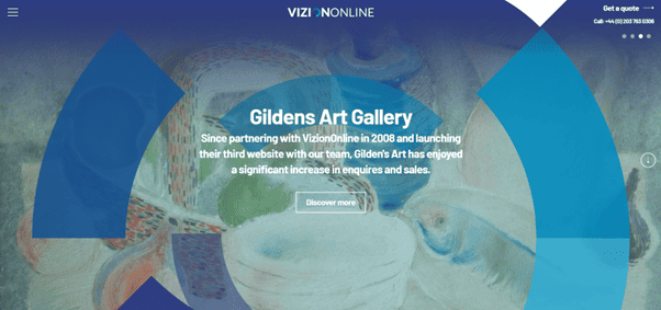
Bold, striking typography, splashed across the front page of your website can look absolutely perfect, letting your copy effectively act as a fundamental part of your website design, while cutting down on noise and less useful parts. Striking typography can be a great way to make a lasting impact, acting as both a highly functional but also minimalist approach, perfect for making beautiful designs and powerful websites, definitely one of the best web design trends of the last few years.
Custom Illustrations
When it comes to making your website stand out in the crowd, custom illustrations can be an amazing way to go. Avoid the glaringly obvious bad stock photos, instead, you can go for something much more original in the form of custom illustration. Don’t go for the middle option and get stock illustrations either, these can look just as cliché as bad stock photos.
Custom illustrations can be a solid way to illustrate important aspects of your business in an original way, helping to build your brand and create a memorable website design that stands apart.
Powerful Mobile Optimisation
Yes, this is absolutely still one of the best and most important web design trends. No website nowadays can avoid the all-important mobile optimisation. The fact is, a huge percentage of people browsing the net are doing it from their smartphones. In fact, the majority are. So, unless you want your website to specifically cater to the small minority still predominantly browsing from their desktop, it’s time to start upping your mobile optimisation game.

Retro Fonts
Another great, tasteful option when it comes to giving a website an interesting edge, using retro fonts is a great web design trend that we’re seeing more and more over the last few years. By providing a vintage contrast to an otherwise modern website, you can produce a juxtaposition that looks fantastic while not being too excessive or in-your-face.
Dark Mode
Dark mode has become steadily more and more popular over the last few years, and it’s definitely a huge web design trend still making waves when it comes to building slick, modern and aesthetic websites. Whether you’re thinking about night-time functionality, or just about the aesthetics of an all-black, darkened front page, dark mode is a gorgeous website design trend.
The Worst of Web Design Trends
Bad Stock Photos
We get it, everyone needs a website, but not everyone can justify super high-quality website photography. This doesn’t mean you can just splash horrendously cliched, commonplace and obvious stock photos all over the place. This becomes extremely apparent to visitors who’ve been on more than one website (E.g., all of them) and it just looks unprofessional.
If you are going to use stock photos, make sure you find some tasteful, interesting and appropriate options, and don’t go with any obvious, glaring options.

Endless Scrolling
Endless scrolling is done. It’s over. As far as navigation and using a website is concerned, there are few things quite as annoying as endless scrolling. You want your visitors to be able to find exactly what they’re looking for, quickly and painlessly. Endless scrolling does not work to this end.
While it can look quite slick, and it’s okay for a blog page, don’t use it for your homepage. As a trend, it’s getting on a bit, and it was never much of a good idea. Instead, keep your homepage functional, snappy and to-the-point, with solid navigation.
Autoplay
Do you want to waste time hunting for the video making noise? Or for the music you weren’t expecting? These web design trends have long overstayed their welcome, and it’s high time we said a permanent goodbye to it. Not least because it’s annoying, but HD video can also slow website loading times right down.
When appropriate, on the right area and ideally without audio, some autoplaying features can be absolutely fine. Try to avoid it on mobile websites, however. At best, autoplaying videos can be more than a little overdone and lack the impact they might once have carried, so it’s best to stay away.
Extreme Minimalism
There’s a balance to be struck with minimalism. Sure, clean, stark websites look great, but if that same minimalism is beginning to get in the way, it might be time to start busying up the space. Minimalism can be gorgeous, there’s no doubt, but functionality comes first.
The reality is, beyond a certain point, extreme minimalism starts to look lazy, and neglects the original purpose of the website. This should be the real crime here, forgetting the original purpose of your site. Sure, a massive HD image with very little else around it looks great and sharp. However, making your visitors hunt for navigation isn’t good.
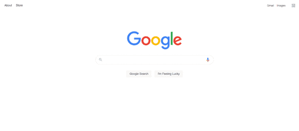
The classic example of great minimalist design.
Constant Pop-Ups; The Worst of the Web Design Trends
Permission for cookies? Join our mailing list? Want a coupon code? Some degree of pop-ups is fine, but when it’s endless, it really can get quite annoying. This is a terrible web design trend. Make sure you’re not bombarding your visitors with endless popups. Especially not the very instant they click onto your site, at least wait a minute!
It’s an inescapable reality that a couple of pop-ups are sometimes absolutely necessary, but pop-up after pop-up? That’s just a recipe for annoying your visitors. Make sure you’re not continually throwing pop-ups at your customers. For the necessary ones, at least spread them out a little.

